Designing a Secure Digital Payments Experience for a Government Healthcare Spending Program
Timeline
Mar 2023 - Jun 2023
Role
Senior UX / Product Designer
Tools and Relevant Systems
Figma, FigJam, Miro, JIRA
Project Overview
As part of a provincial Healthcare Spending Account (HSA) program, our team was asked to rapidly explore what a mobile-first experience could look like for both citizens and licensed service providers.
Unlike the web portal (focused on onboarding and administration), this mobile initiative was a proof of concept (POC) designed to:
Empower citizens to view balances, search for providers, and track transactions
Enable providers to invoice and receive payment digitally
Validate whether a mobile experience could streamline funding disbursement and improve accessibility
This work demonstrated how a government-funded healthcare benefit could operate through a modern, intuitive, digital experience.
Summary
I was a Senior UX / Product Designer embedded within a cross-functional service design and delivery team.
I:
Led mobile interaction and workflow design for both citizen and provider journeys
Translated policy rules and reimbursement logic into usable app flows
Created user stories and epics to structure sprint-based delivery
Designed high-fidelity Figma mockups across core app features
Facilitated design reviews with product, policy, and development teams
Iterated on flows based on technical feasibility and stakeholder feedback
Supported acceptance criteria and backlog refinement
I played a critical role in bridging policy intent, technical constraints, and user experience clarity within a compressed POC timeline.
My Role
The Problem
The province was investing in preventative healthcare by allocating funds directly to citizens through an HSA model. However:Citizens had no centralized, easy way to view balances or track transactionsService providers lacked a streamlined digital workflow to invoice and receive paymentExisting processes were fragmented, manual, and policy-heavyThere was uncertainty around whether a mobile-first approach would be viable or intuitive
The question wasn’t just “what should this app look like"?”It was:“Can we design a secure, compliant, and usable mobile ecosystem that supports both sides of the healthcare funding model?”
Design Process
The mobile app followed a lean, agile process across three primary phases:DesignBuildTest
Each phase operated in 2-week sprints with Analyze > Plan > Deploy sub-steps.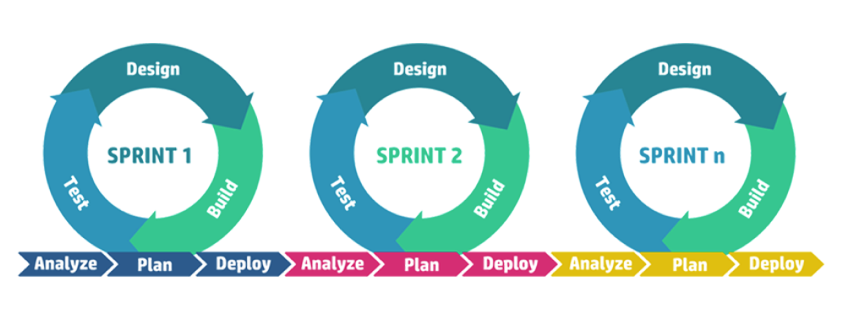
This phase focused on defining the experience architecture and validating the right problem to solve.
01. Design
In this initial step, our focus was on defining the problem space and structuring the mobile MVP at a strategic level - not yet designing detailed flows.
Our team:
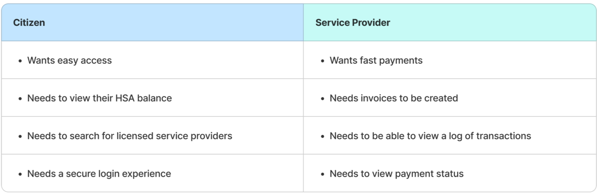
Identified and aligned on key personas (citizens and licensed service providers)
Clarified the core value propositions for each user type
Translated program rules and policy requirements into structured user stories
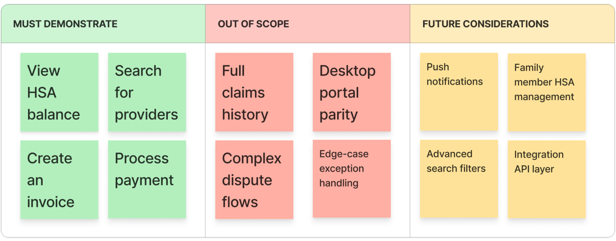
Identified priority use cases for proof of concept (e.g., view balance, search for providers, create invoice, process payments)
Defined success criteria for what the POC needed to demonstrate
Analyze
My contribution:
In this step, I focused on shaping the experience strategy rather than detailed interaction design. I worked closely with product and policy stakeholders to:
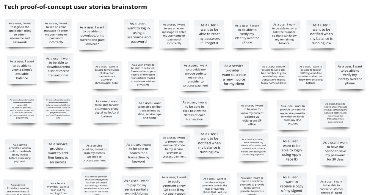
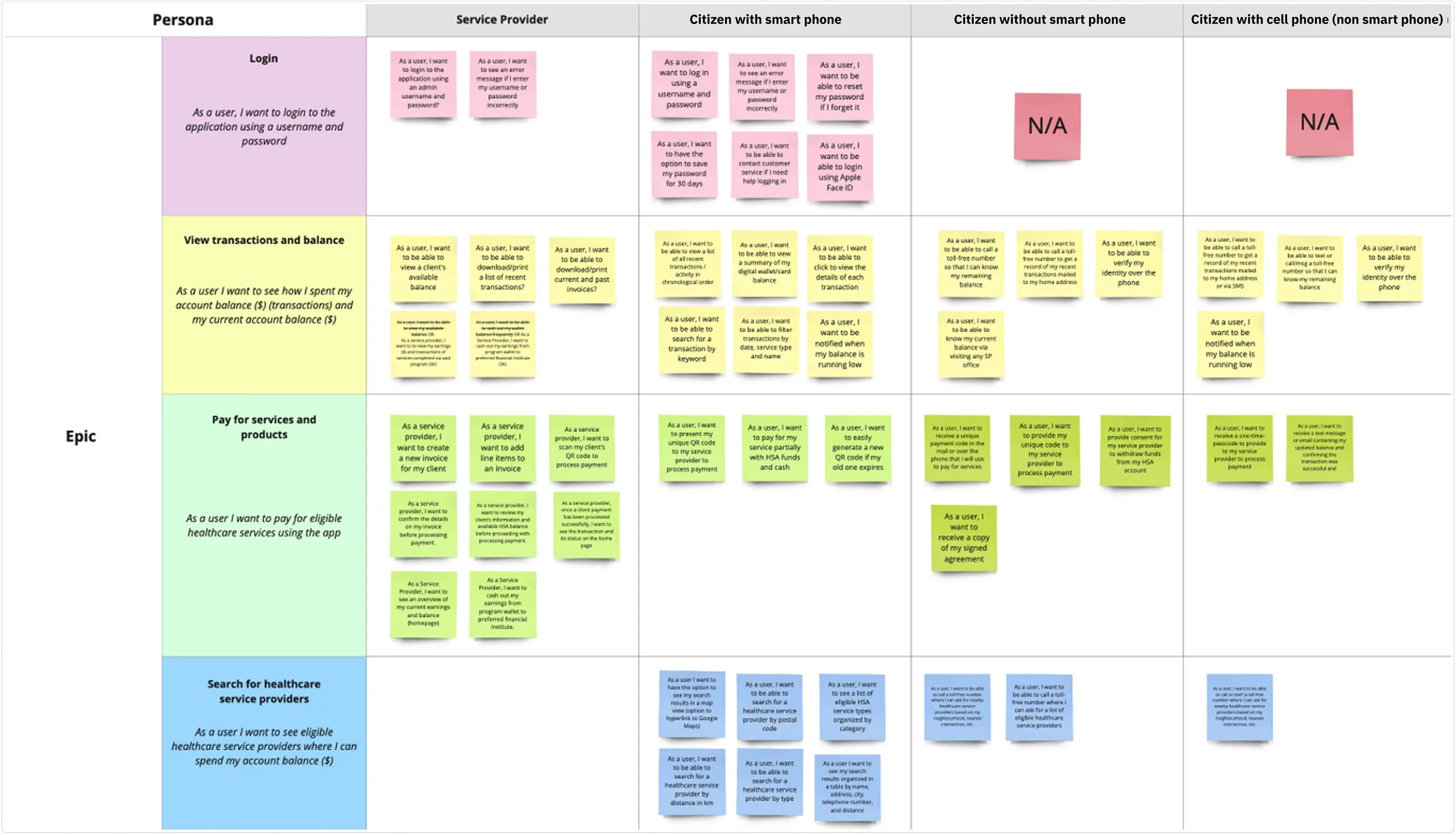
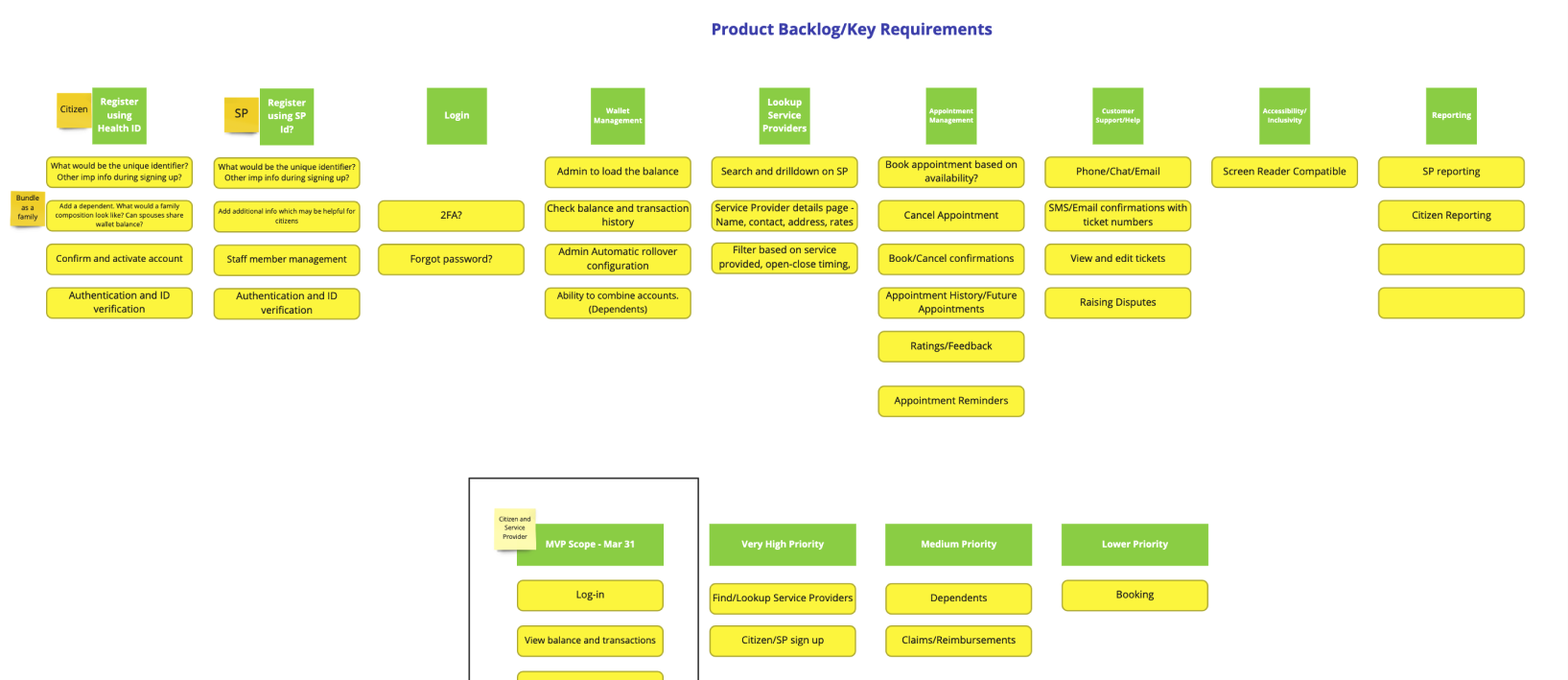
Translate complex healthcare funding rules into clear user stories (shown below)
Define the initial mobile feature set and MVP boundaries
Identify risk areas (eligibility validation, payment confirmation, balance visibility)
Ensure both citizen and provider perspectives were equally represented
This step laid the foundation for more detailed user flow and interface work that followed in the ‘Build’ phase.
Design implication:
The POC needed to demonstrate both financial transparency for citizens and operational efficiency for providers.
Following the initial analysis and persona alignment, we moved into planning the mobile proof of concept. The objective of this phase was to translate high-level program requirements into a structured, sprint-ready, product scope.
What we did:
Consolidated user stories across both citizen and service provider personas
Grouped related stories into feature-based epics
Identified cross-role dependencies (e.g., payment requires provider verification)
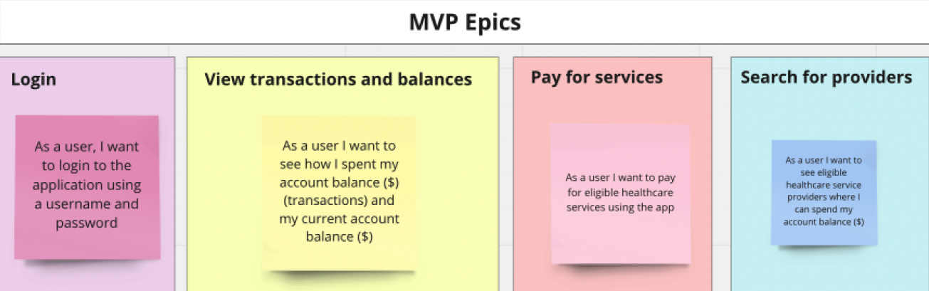
Defined MVP boundaries for the proof of concept
Prioritized epics based on feasibility, impact, and demonstration value
Because this was a proof of concept, we were not designing for full production readiness. Instead, we focused on validating the core transactional loop of the HSA ecosystem:
Search > Select > Pay > Confirm > Track
Plan
My Contribution:
As a Senior UX/Product Designer embedded within the cross-functional team, I played a key role in structuring and shaping the mobile backlog.
Specifically, I:
Facilitated the grouping of user stories into mobile-specific epics (shown below)
Ensured both citizen and provider journeys were represented in the MVP scope
Advocated for balancing usability and policy constraints
Helped define which features were critical to demonstrate the end-to-end experience
Worked closely with product and delivery leads to ensure sprint capacity aligned with design ambition
I translated regulatory requirements into structured, user-centred product increments that the team could realistically design and prototype within the sprint timelines.
Once the MVP scope was defined and validated, we transitioned from concept to execution by formalizing features into structured backlog items. This step ensured that design intent could be implemented clearly, incrementally, and without any ambiguity.
What we did:
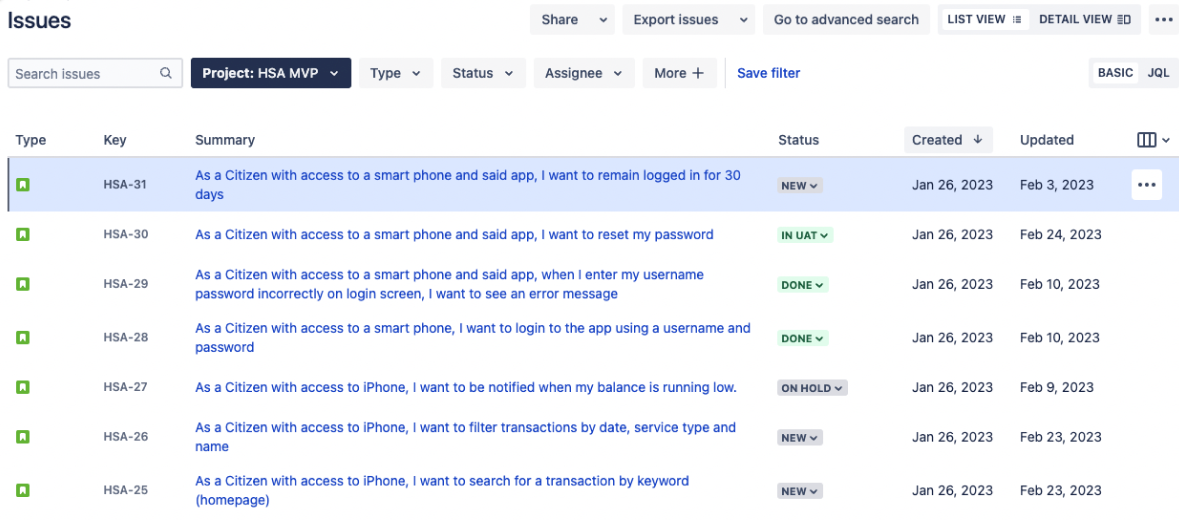
Converted validated user stories in Miro into Jira tickers
Defined acceptance criteria for each user story
Linked stories to corresponding epics
Identified dependencies across citizen and provider functionality
Prioritized items for sprint sequencing
Ensured compliance and policy requirements were embedded into acceptance criteria
This step bridged design and engineering, moving the mobile POC from exploration into build-ready delivery.
Deploy
My Contribution:
As the Senior UX/Product Designer on the project, I played an active role in shaping how design translated into the backlog.
Specifically, I:
Authored and refined user stories to reflect real user behaviour (not just system requirements - see screenshot below)
Defined acceptance criteria to preserve usability intent
Ensured edge cases surfaced during design were captured in backlog items
Worked closely with product and engineering to clarify scope and reduce ambiguity
Advocated for usability within sprint constraints
Ensured both citizen and provider perspectives were represented in Jira ticket structure
This minimized rework and aligned the team around a shared understanding of what “done” meant.
This phase focused on translating the product scope into a cohesive mobile experience through intuitive, user-centred flows and interfaces for both citizens and service providers.
02. Build
With high-level epics prioritized in the Design phase, we moved into refining those concepts into more actionable, build ready requirements.
This step focused on pressure-testing scope, clarifying any assumptions, and collaboratively ensuring each story was:
User centred
Policy aligned
Technically feasible
Clear enough for engineering to implement
Rather than immediately jumping into task flows and wireframes, we ensured the foundation was structurally sound.
What we did:
Broke down epics into granular user stories
Identified dependencies between features
Clarified edge cases and alternate scenarios
Refined acceptance criteria at the user story level
Aligned scope with MVP constraints
Re-prioritized based on feasibility and program risk
We moved from conceptual groupings to a structured backlog that engineering could realistically build against.
Analyze
My Contribution:
As the Senior UX/Product Designer, I played a key role in:
Leading user story refinement sessions to ensure they reflected real user intent (see below)
Challenging ambiguous or assumption-based requirements
Identifying missing edge cases across citizen and provider journeys
Aligning stories with policy constraints and operational realities
Structuring stories into clear MVP, high-priority, and lower-priority buckets
Ensuring scope stayed grounded in the POC’s time and feasibility constraints
I helped translate stakeholder intent into user-centred, testable requirements - reducing downstream ambiguity during design and development.
With refined epics and prioritized stories in place, we moved into mapping the end-to-end task flows for each of the four personas that would shape the core user journeys.
Before designing visual interfaces, we focused on defining:
How users would move through the system
What decisions they would need to make
Where policy or system constraints would influence the experience
How edge cases would be handled
This step ensured we were designing coherent journeys - not disconnected screens.
What we did:
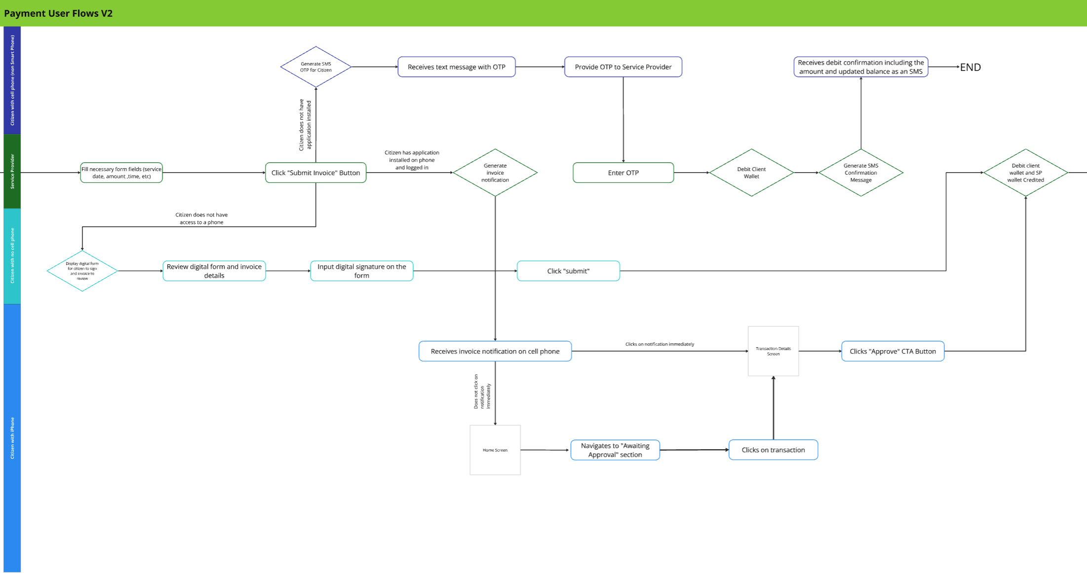
Mapped task flows for core MVP journeys (e.g., login, view balance, search for providers, book appointments)
Identified branching logic and decision points
Accounted for validation states and error handling
Structured happy path vs alternate path scenarios
Created low-fidelity wireframe flows to visualize task progression
Reviewed flows with stakeholders and technical leads to validate feasibility
Starting with a low-fidelity approach allowed us to iterate quickly on structure and logic before committing to detailed interface design.
Plan
My Contribution:
As the Senior UX/Product Designer, I:
Led the creation of user task flows across citizen and provider journeys (see below)
Translated refined user stories into visual flow diagrams
Identified missing steps and logic gaps across scenarios
Designed low-fidelity wireframe flows in Figma to align stakeholders on structure (see below)
Facilitated reviews to validate logic against policy and operational constraints
Iterated based on feedback before advancing to high-fidelity design
By clarifying the experience architecture early, I reduced ambiguity in later design stages and minimized rework during development.
Why This Step Mattered
This step was critical because:
It aligned cross-functional teams on how the experience would function
It surfaced edge cases before high-fidelity UI design began
It ensured that flows were technically and operationally realistic
It created a shared blueprint for the next phase of detailed design
Instead of designing screens in isolation, we designed structured journeys grounded in real-world constraints.
After validating user flows and low-fidelity wireframes, I led the transition into high-fidelity UI design. My role focused on transforming complex healthcare and financial workflows into a clear, mobile-first experience that felt trustworthy, intuitive, and scalable.
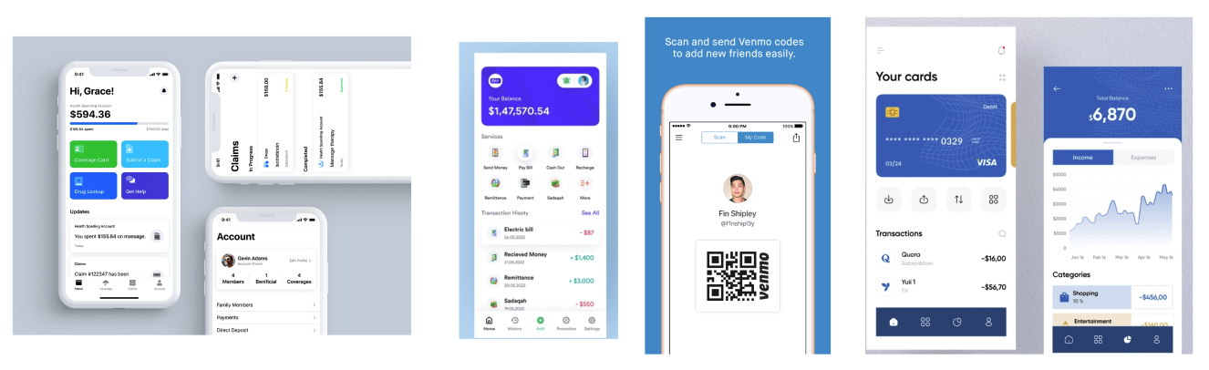
To ground the visual direction in proven patterns, I conducted a focused UI benchmarking exercise across:
Fintech and banking applications (for balance and transaction clarity)
Healthcare platforms (for credibility and compliance)
Payment processing tools (for invoicing workflows)
Government digital services (for accessibility and trust)
My contribution:
Synthesized visual and interaction patterns into a defined mobile design direction
Identified leading practices for financial hierarchy and status communication
Mapped inspiration back to validated user needs from discovery
Established visual principles before moving into high-fidelity execution
This ensured the design was intentional, not aesthetic-driven.
Deploy
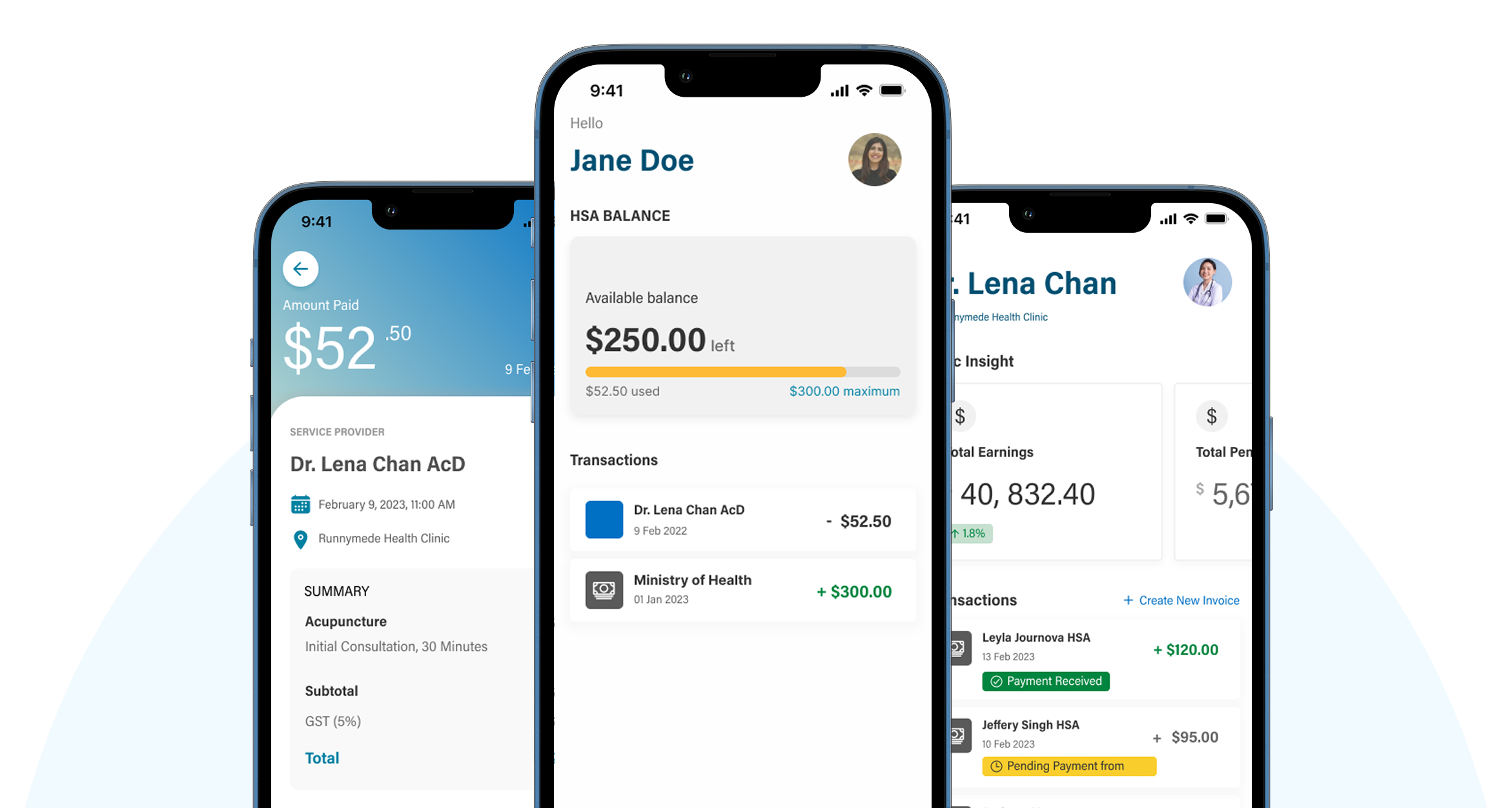
Designing High-Fidelity Mockups
I designed the complete high-fidelity experience for both primary personas:
Citizen (HSA holder)
Service Provider (SP)
My specific contributions:
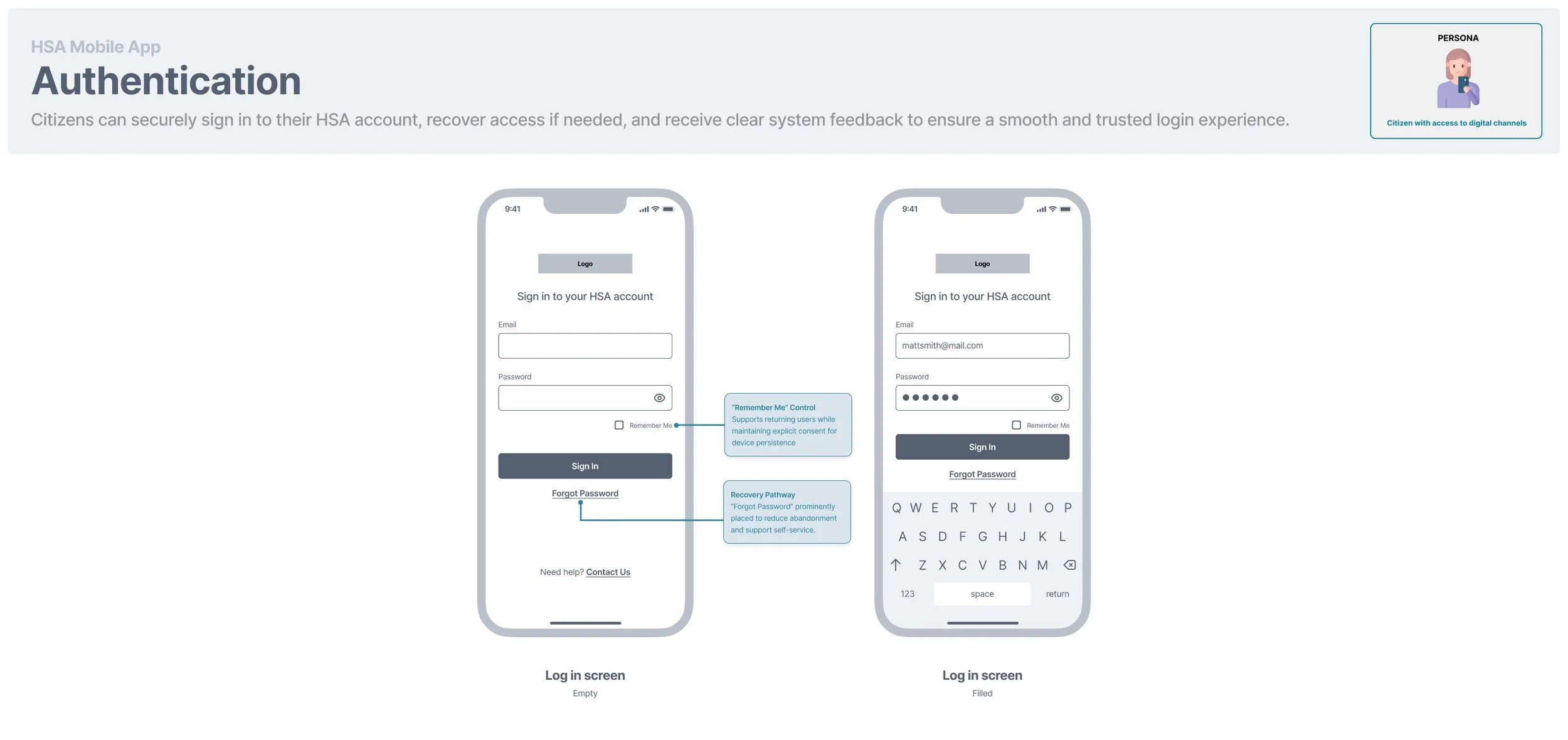
1 . Established the visual system for the mobile experience
I defined the UI direction for the Citizen app including:
Hierarchy and layout patterns for balance and transaction views
Visual treatment of financial data (progress indicators, summary cards, transaction lists)
Button styles, status indicators, and interactive states
Consistent use of colour to reinforce meaning (available balance, pending, processed)
The design emphasized clarity, financial transparency, and ease of scanning - critical for health-related payments.
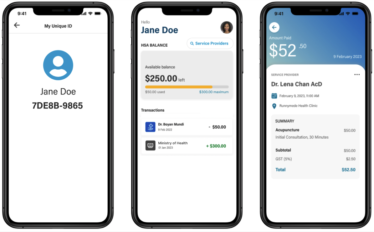
2 . Designed the “View Balance & Transactions dashboard
I created a simplified home experience that allows citizens to:
Instantly view available HSA balance
Understand remaining limits via visual progress indicators
See recent transactions at a glance
Access detailed transaction breakdowns with one tap
Special attention was given to:
Progressive disclosure (summary —> detailed view)
Clear differentiation between credits and debits
Making financial data readable on small screens
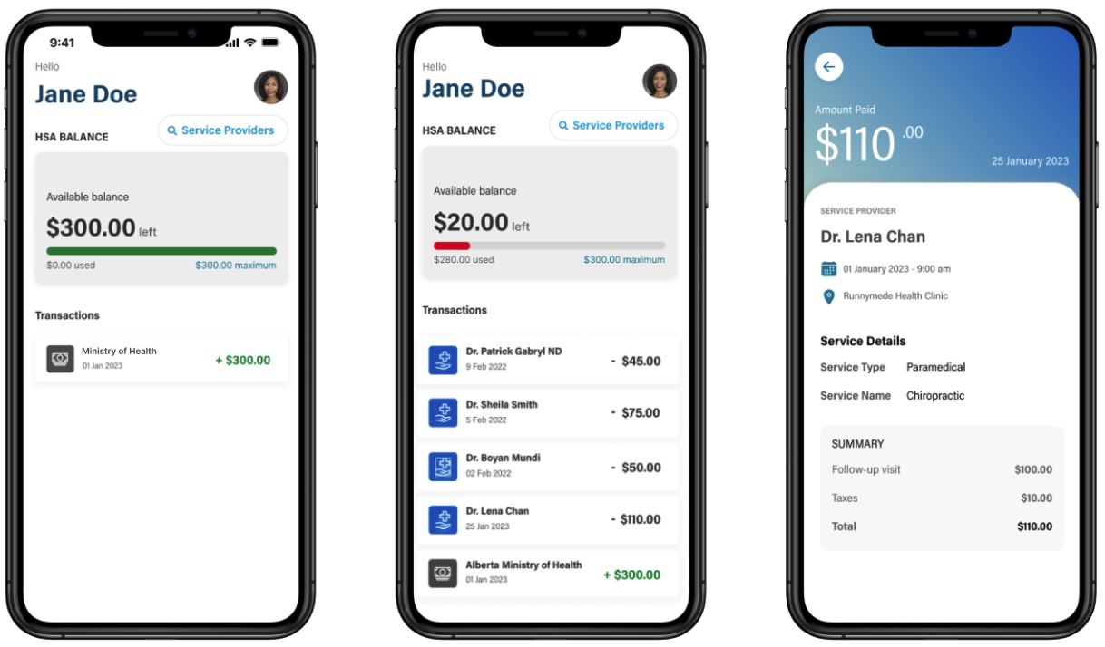
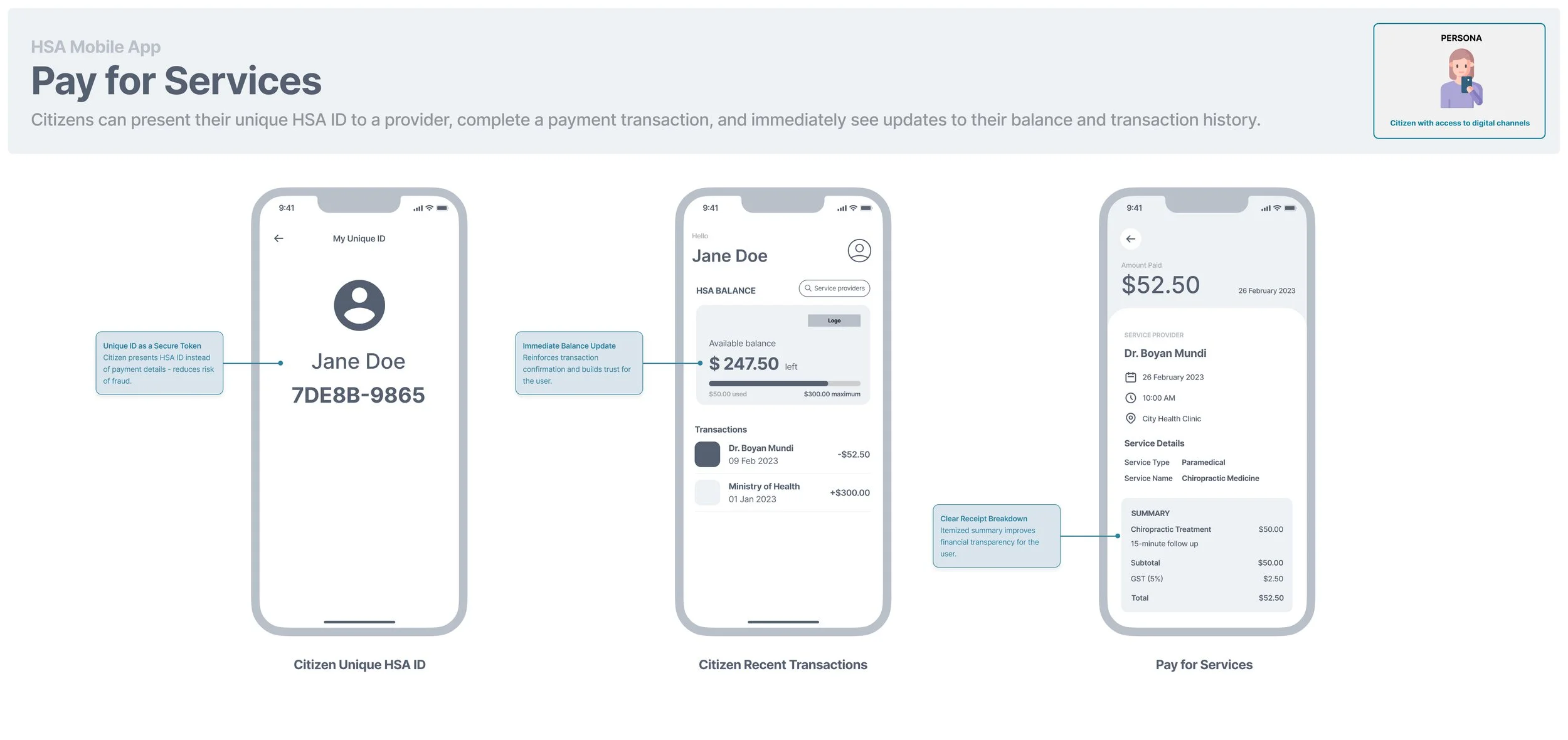
3 . Designed the “Pay for Services” flow (QR-based payment)
To support seamless point-of-service payments, I designed:
A QR code screen for citizens to present to providers
Real-time balance updates post-transaction
Clear confirmation states
Detailed transaction summaries with downloadable invoice options
I focused on:
Reducing anxiety around payment processing
Making transaction details transparent (service type, provider, taxes, totals)
Reinforcing trust through clear confirmation and status states
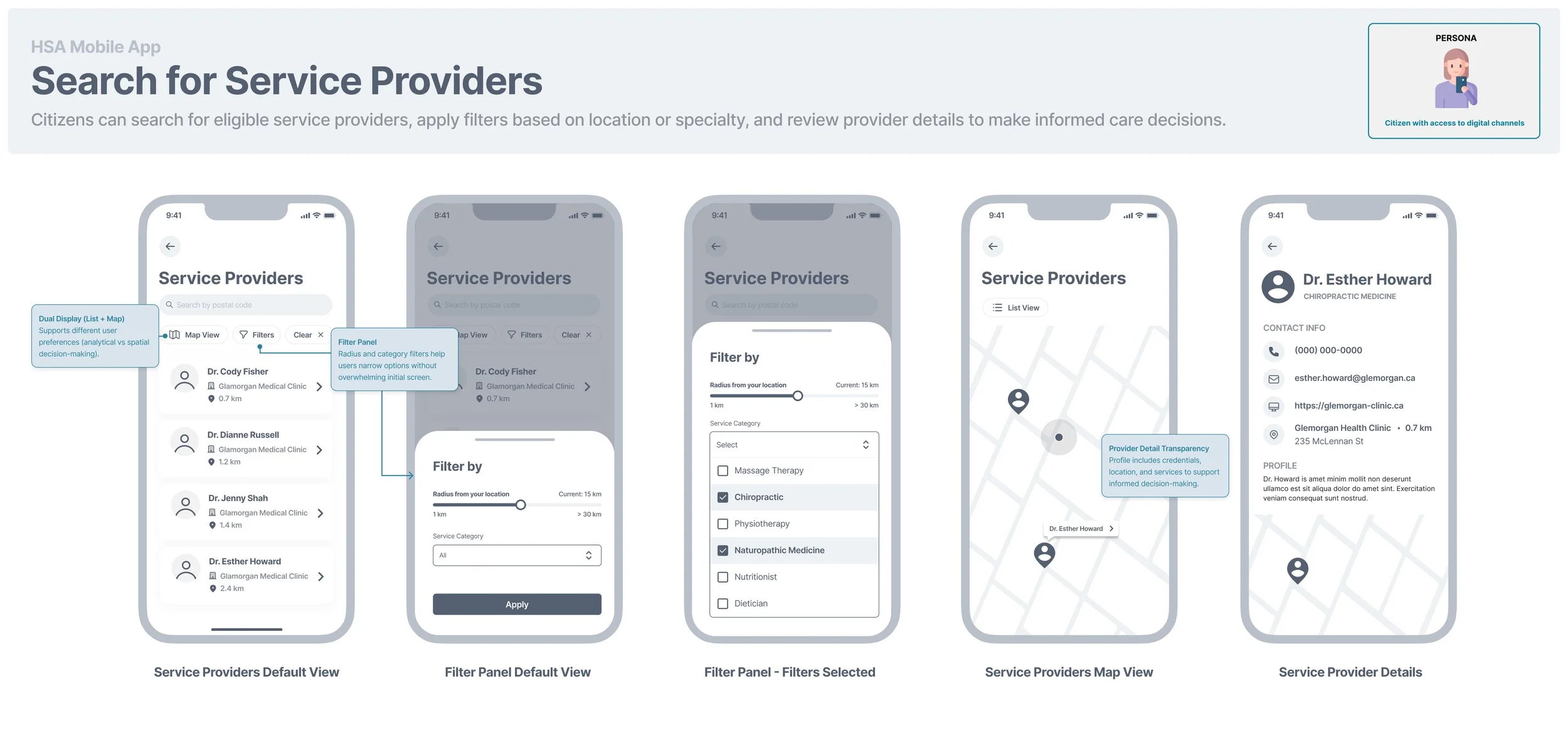
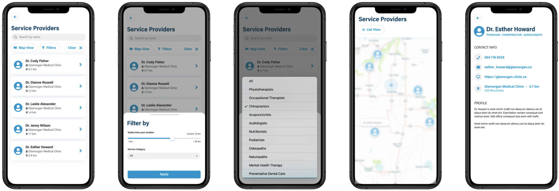
4 . Designed the Service Provider Search & Discovery Experience
I developed a full search and filtering experience that included:
List and map views
Filter panels for service categories
Provider detail pages with contact and service information
The design balanced:
Efficiency (quick scanning in list view)
Spatial awareness (map-based browsing)
Decision support (clear provider information before payment)
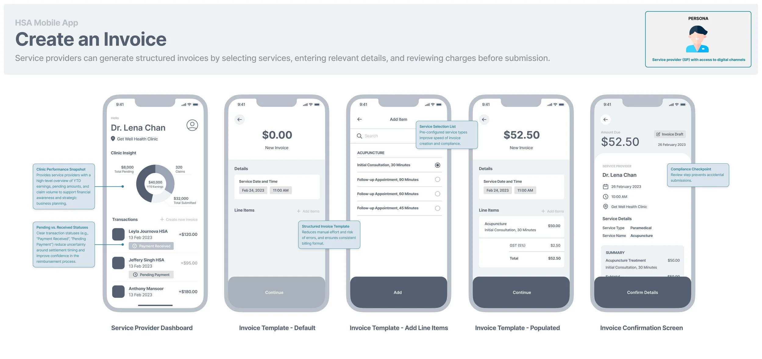
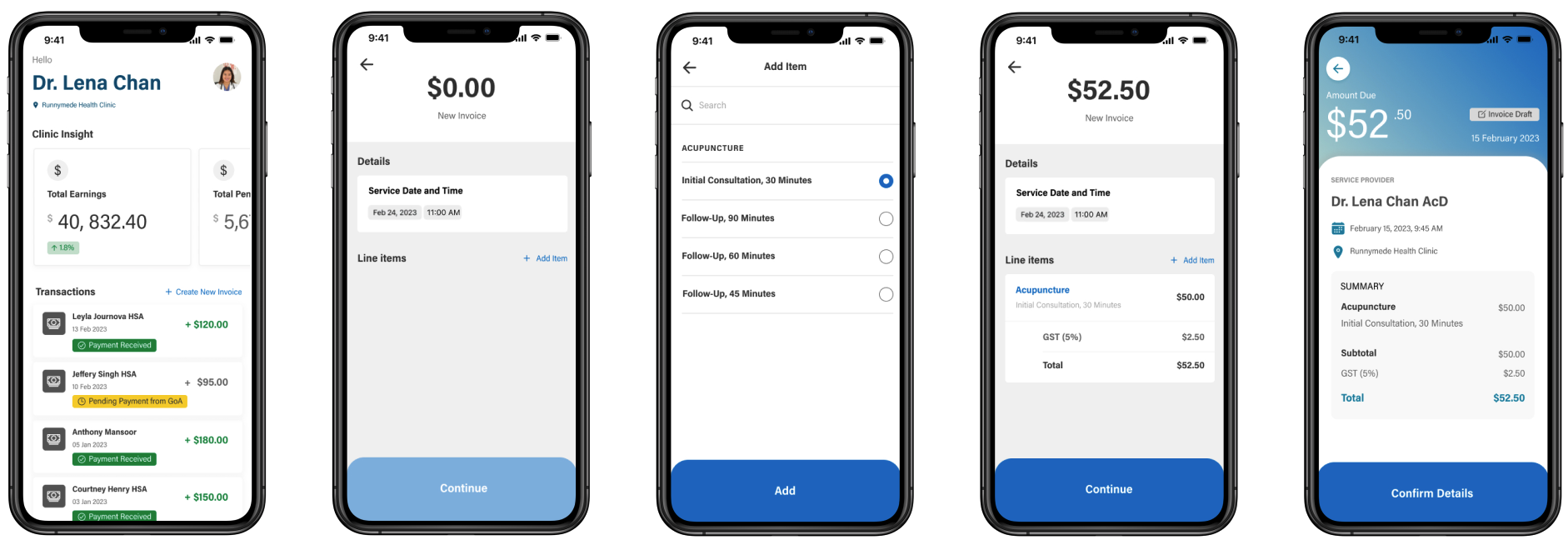
5 . Designed the Invoice Creation Experience for Service Providers
I designed an intuitive invoice creation flow that enables providers to:
Select service type and duration
Add line items
Review cost breakdown (subtotal, tax, total)
Confirm transaction details before processing
Design priorities:
Minimize administrative burden
Reduce manual errors
Make financial breakdowns transparent
Support fast in-clinic workflows
The invoice flow was structured as a guided progression to prevent incomplete submissions and ensure accuracy.
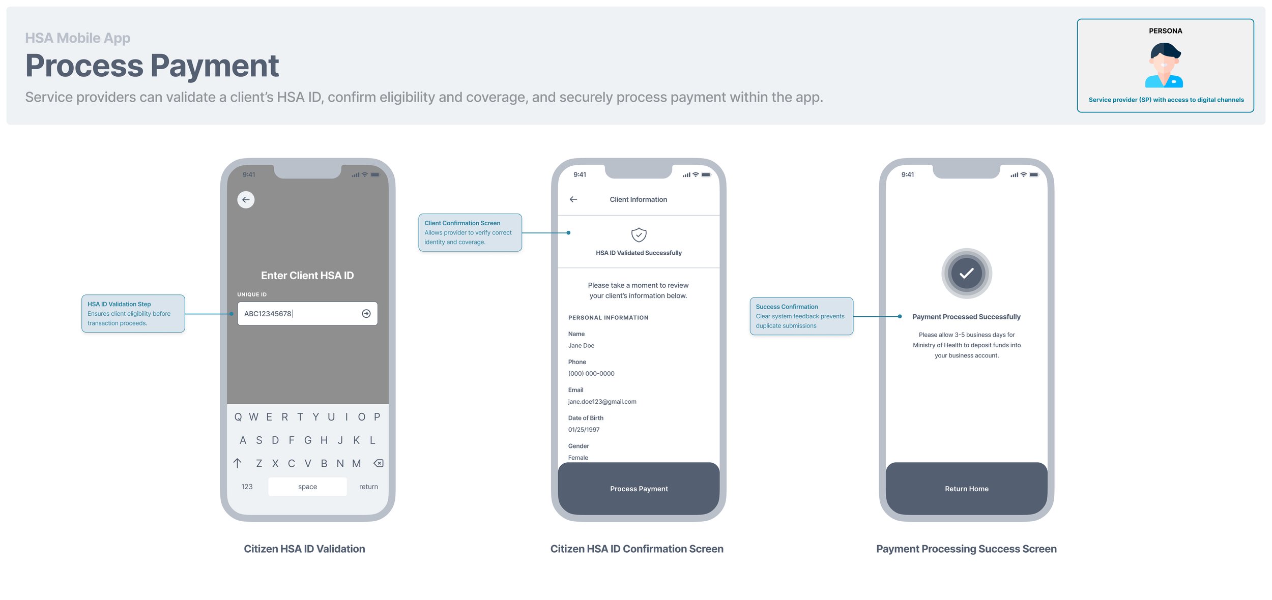
6 . Designed the Payment Processing Flow for Service Providers
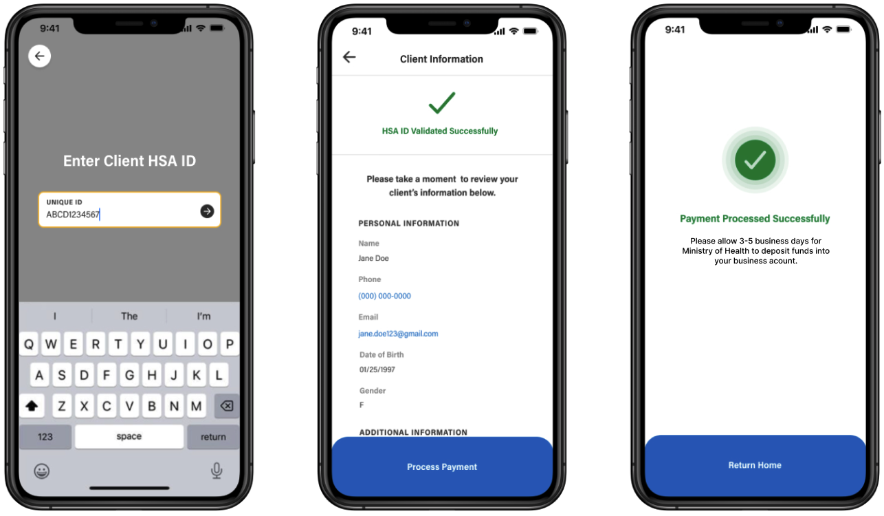
I designed a secure validation flow where providers:
Enter the client’s HSA ID
Review validated client information
Confirm available balance in the background
Process payment
Receive confirmation of successful submission
This flow reinforces trust and security by:
Providing validation feedback
Showing balance availability
Confirming settlement expectations
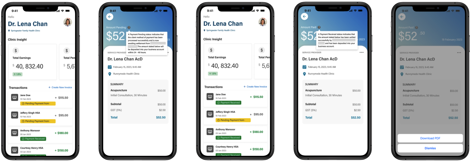
7 . Designed the Flow for Service Providers to View Transaction Statuses and Download Invoices
I designed the dashboard to:
Surface total earnings and pending payments
Display transaction status (Pending, Received)
Allow invoice download
Update payment status after settlement
The dashboard balances financial reporting needs with operational simplicity.
The Outcome of this Phase
By the end of the ‘Build’ phase:
Stakeholders could visualize the complete mobile experience
Technical teams had concrete interaction specifications
The ecosystem logic (Citizen <-> Service Provider <-> Program settlement) was clearly represented
The product vision moved from conceptual to ready for testing
In the final phase of the project, I collaborated closely with the development team to validate the feasibility, refine edge cases, and prepare the designs for implementation. This phase focused on translating high-fidelity mockups into build-ready specifications
03. Test
Once high-fidelity mockups were completed for both Citizen and Service Provider experiences, I led structured design review sessions with developers.
The goal was to:
Validate technical feasibility
Identify potential edge cases
Clarify interaction behaviours
Reduce ambiguity before development began
During these sessions, we walked through each epic screen-by-screen, including:
Transaction state logic (Pending, Received, Settled)
Invoice creation validation rules
Payment confirmation flows
Disabled states and error handling
Data dependencies between Citizen and Service Provider experiences
Analyze
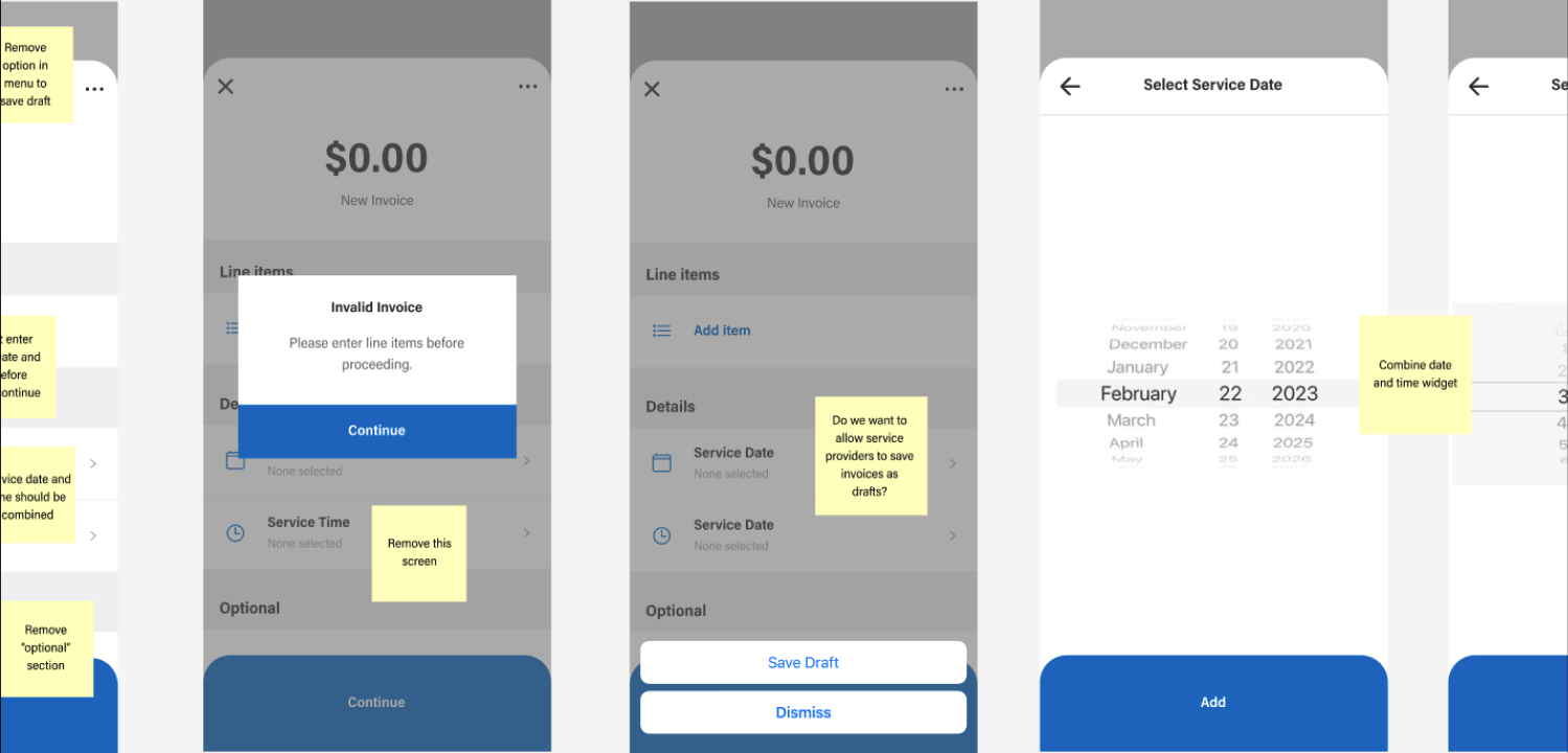
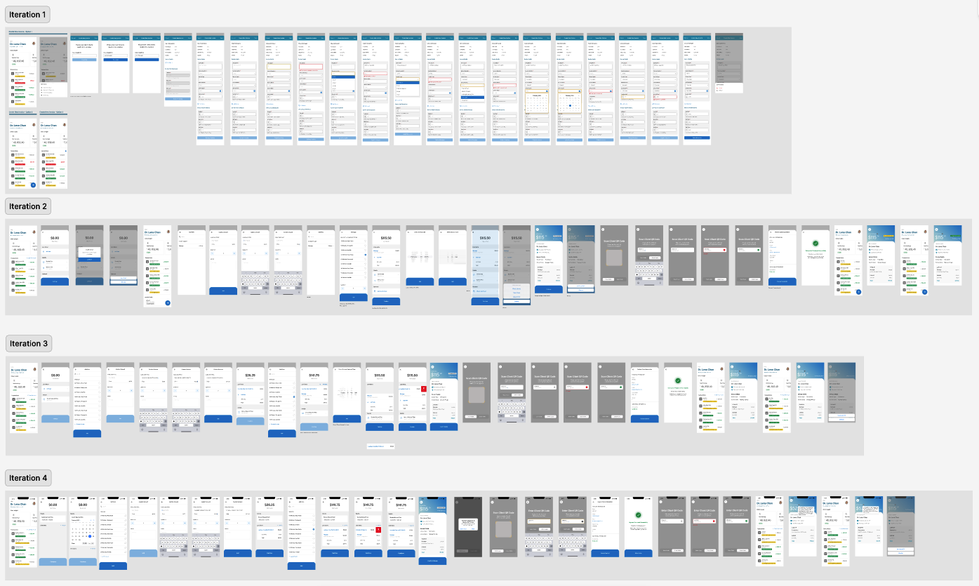
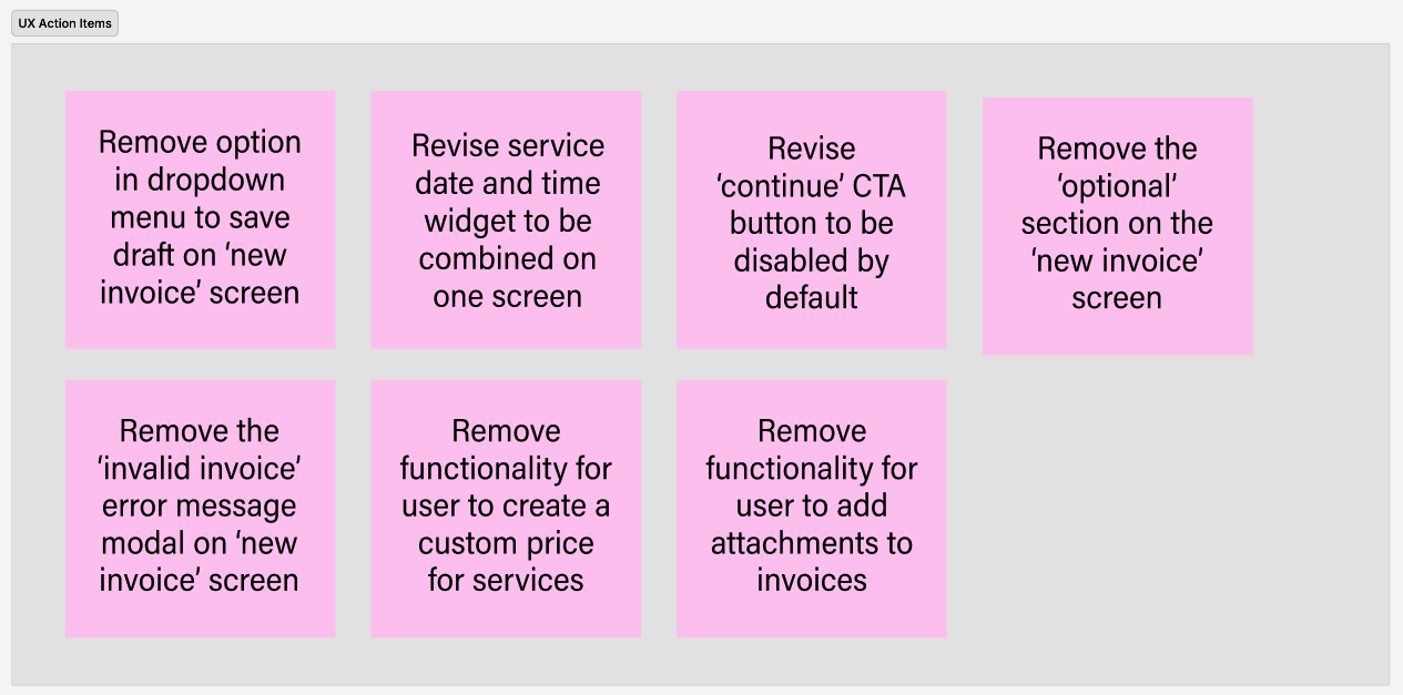
Based on developer feedback and technical constraints, I iterated on the designs several times to:
Simplify dropdown logic in invoice creation
Combine service date and time selection into a unified interaction
Remove optional fields that introduced unnecessary complexity
Adjust CTA states (e.g., disabling “Continue” until required inputs were complete)
Clarify back-navigation and system messaging
These refinements ensured the experience remained intuitive while aligning with backend logic and API constraints.
Plan
After each review session, I documented UX action items and categorized them by:
Functional refinement
Validation logic
UI simplification
Copy clarification
State handling
I then created an updated iteration of the mockups reflecting these changes (shown above) and revalidated them with stakeholders and the development team.
This iterative loop helped:
Reduce rework during development
Surface assumptions early
Ensure consistency across Citizen and SP flows
Align on a shared understanding of system behaviour
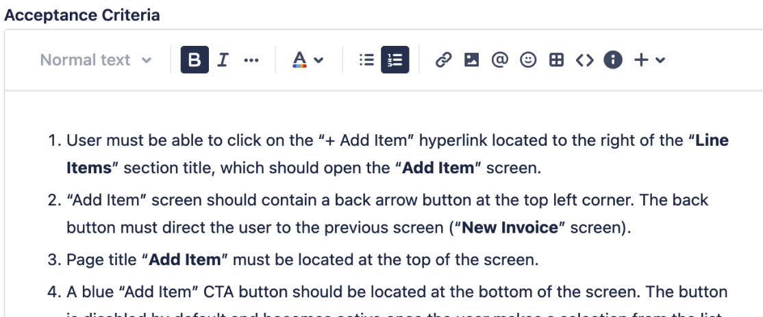
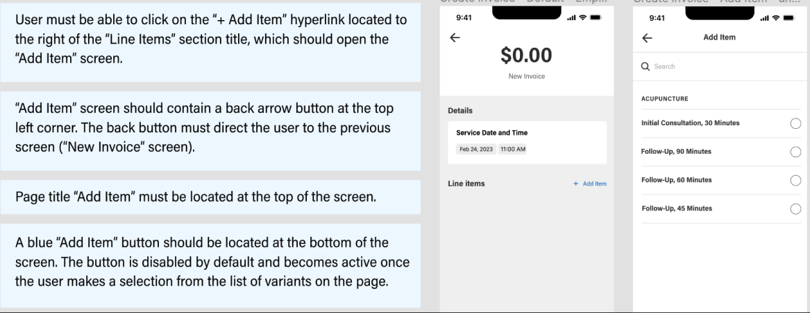
Once the designs were finalized after multiple review cycles, I transitioned into supporting implementation by refining and clarifying acceptance criteria with JIRA.
For each user story, I:
Translated visual designs into clear, testable criteria
Defined required and optional states
Specified validation rules and system feedback
Documented success and error states
Clarified conditional behaviours (e.g., payment settlement timing, transaction status updates)
This ensured that:
Developers had unambiguous implementation guidance
QA could validate behaviour against defined criteria
Design intent was preserved through build
Deploy
The Outcome of this Phase
By the end of the ‘Test’ phase:
Designs were implementation-ready
Acceptance criteria reduced ambiguity and misinterpretation
Cross-functional alignment improved delivery efficiency
The experience transitioned smoothly from design to development
Following the test phase, the finalized designs and acceptance criteria were handed off to development for implementation. I remained engaged throughout the build to answer questions, clarify edge cases, and ensure the design intent was preserved.
The project ultimately moved into development with aligned stakeholder expectations, validated interaction patterns, and clearly defined system behaviours across both Citizen and Service Provider experiences.
Key Takeaways from this Project
This project reinforced the importance of designing beyond individual screens and thinking in terms of interconnected systems. Creating experiences for both Citizens and Service Providers required careful consideration of transaction logic, edge cases, and operational workflows - not just visual design.
It also strengthened my ability to navigate ambiguity, collaborate closely with cross-functional teams, and translate complex policy and business requirements into clear, intuitive mobile interactions. Most importantly, it demonstrated how iterative alignment with development can significantly reduce risk and ensure design intent carries through implementation.