Designing a Service Provider Web Portal for a Government Healthcare Spending Program
Timeline
Jan 2023 - Jun 2023
Role
Senior UX / Product Designer
Tools and Relevant Systems
Figma, Miro, Maze
Project Overview
Summary
I led UX design for a secure service provider web portal supporting a new provincial Healthcare Spending Account Program. The portal enabled licensed providers to register, verify eligibility, submit claims, and receive reimbursement under a public healthcare funding model.
The program combined policy, operations, and digital service delivery, requiring complex regulatory and workflow requirements to be translated into a clear, trustworthy, and usable provider experience.
My work focused on turning policy-driven rules and edge cases into structured, intuitive portal flows through journey mapping, service blueprinting, high-fidelity interface design, and iterative cross-functional validation.
My Role
I was a Senior UX / Product Designer embedded within a cross-functional service design and delivery team. I owned the end-to-end provider portal experience - from workflow definition through high-fidelity design - and acted as a bridge between policy intent, operational feasibility, and user experience.
I translated regulatory and program constraints into implementable UX patterns while aligning closely with product, policy, and engineering stakeholders.
Key contributions included:
Designing provider onboarding, verification, and reimbursement workflows
Creating portal UX architecture and interaction flows
Producing high-fidelity mockups and design specifications
Leading cross-stream design reviews with policy, product, and technology teams
Iterating designs based on stakeholder and provider feedback
Supporting edge-case handling and rule-driven UX decisions
Collaborating with developers to ensure design feasibility and implementation clarity.
The Problem
A new Canadian provincial healthcare funding program required a digital portal that service providers could trust and use with confidence - but the ecosystem was complex and evolving. Service providers needed to:
Enroll and verify credientials
Set up clinic and staff profiles
Connect banking details
Submit and track transactions
Manage reimbursement activity
Key challenges:
Requirements were evolving alongside policy decisions
Workflows spanned multiple systems and departments
Provider digital maturity varied widely
Compliance and verification steps added friction
Errors could result in payment or eligibility issues
No existing UX model covered this workflow end-to-end
The risk: a confusing or burdensome provider experience would reduce adoption, increase support load, and create operational bottlenecks.
We needed to design a clear, low-friction, high-trust portal experience grounded in real provider workflows.
How might we design a human-centred digital experience that makes HSA enrolment, verification, and payment workflows clear, trustworthy, and efficient - while still meeting regulatory and operational requirements?The Design Challenge
Design Process
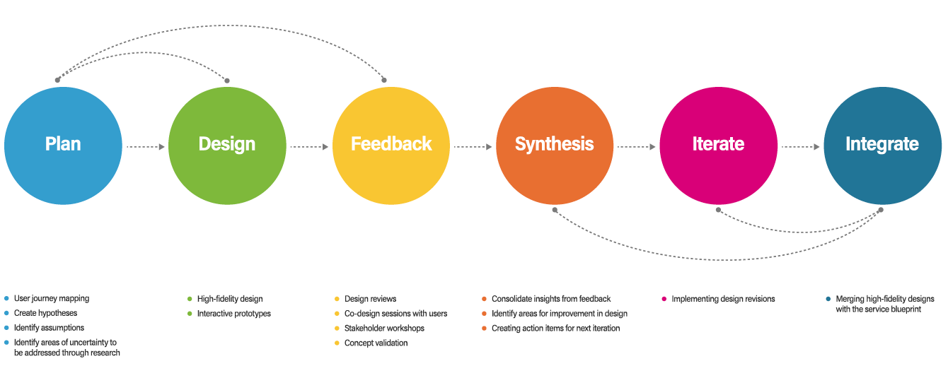
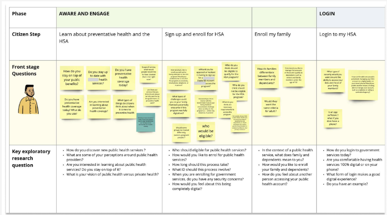
The program design team adopted an Agile UX approach to design the user interface of the service provider web portal. The Agile design process was broken down into six stages, with a set of key activities associated with each. 01. Plan
Mapping out the end-to-end provider journey.
We began by mapping the full end-to-end journey for service providers and citizens, covering enrolment, account setup, transactions, and payment processing. Early journey drafts were built from program documentations and policy requirements, then validated through cross-functional reviews and provider co-design sessions.
As the Senior UX Designer on the project, I contributed directly to shaping and refining the provider journey by:
Translating policy and operational requirements into user-understandable steps
Identifying UX risks and friction points in early journey assumptions
Refining task sequences and decision points based on stakeholder and provider feedback
Ensuring the journey structure could be realistically supported by a digital experience
My work helped evolve the journey from a policy-driven flow into a user-centred, implementable experience model that could guide detailed interface design.
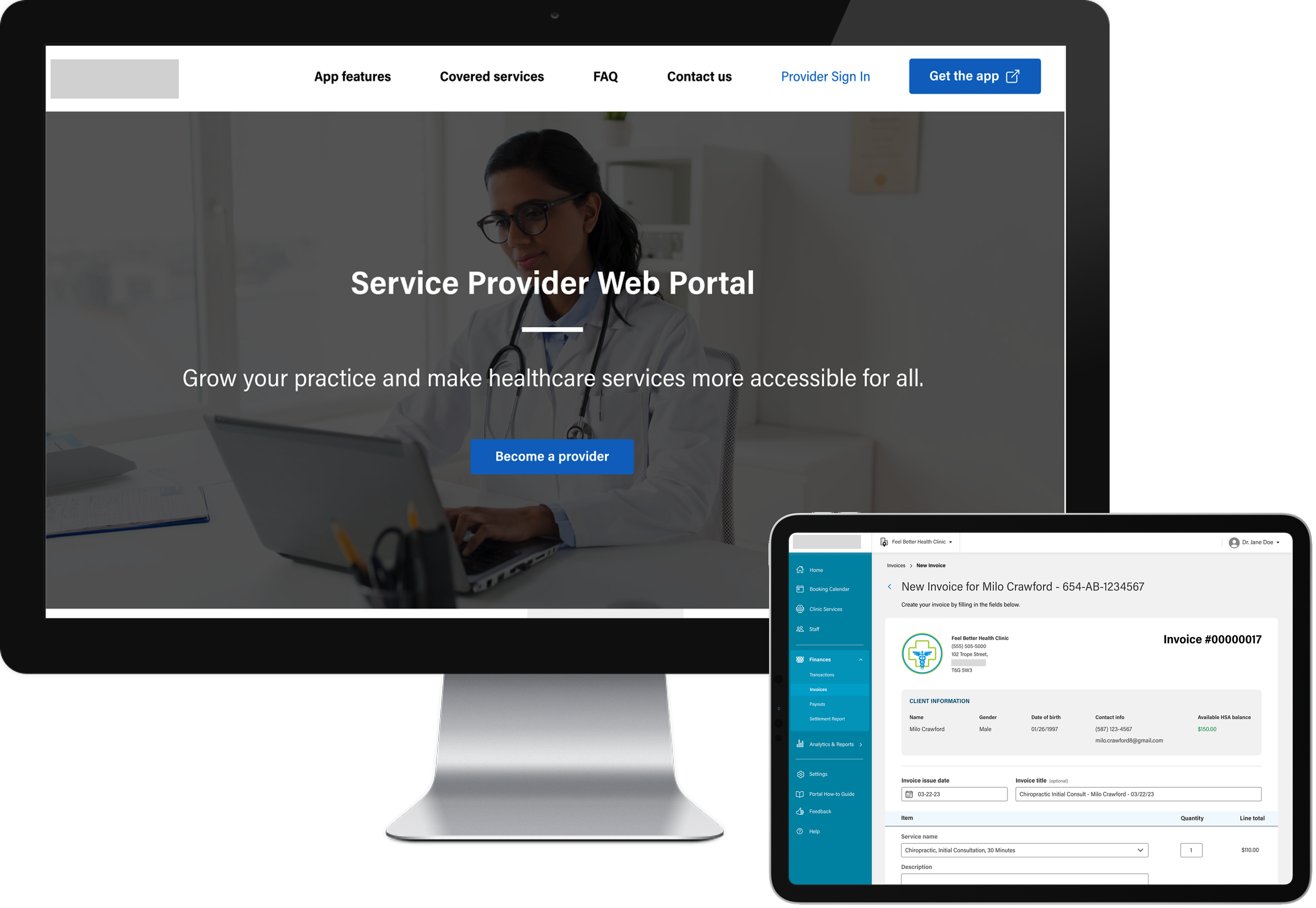
02. Design
Designing high-fidelity portal workflows in Figma
Once the blueprint and journey stages were validated, I led the UX design of the provider web portal experience in Figma. I translated the previously mapped journey steps into detailed interaction flows and high-fidelity mockups that visualized how providers would enrol, set up accounts, manage profiles, and process payments.
My contributions included:
Designing core portal task flows and screen-level interactions
Structuring navigation and information architecture for provider tasks
Creating high-fidelity mockups aligned with program rules and edge cases
Ensuring consistency across multi-step workflows
Preparing design artifacts for cross-stream design and technical reviews
These mockups became the primary artifact used by stakeholders and technical teams to evaluate feasibility, compliance, and usability before implementation.
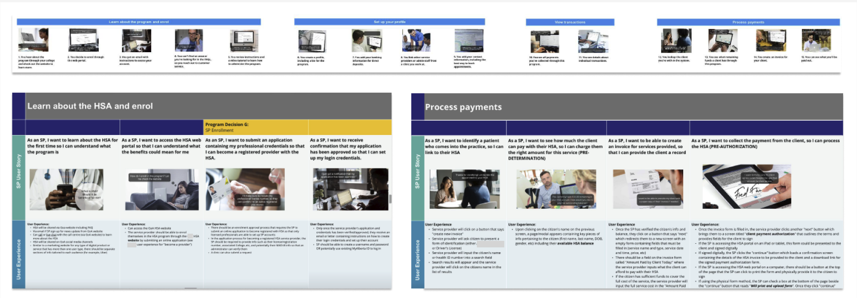
For each major provider journey stage - enrolment, account setup, transaction management, and payment processing - I translated service blueprint steps into detailed UI workflows and interface designs.
I focused on:
Breaking down complex regulatory and verification requirements into clear UI steps
Designing guided, low-error onboarding and setup flows
Structuring data-heavy screens (transactions, payments) for clarity and scanability
Accounting for document upload, credential verification, and audit requirements
Aligning each design decision with program rules and operational constraints
This ensured that each journey stage was not only usable, but compliant and operationally realistic.
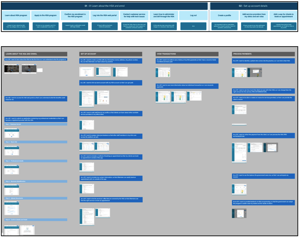
Designing key provider journey stages
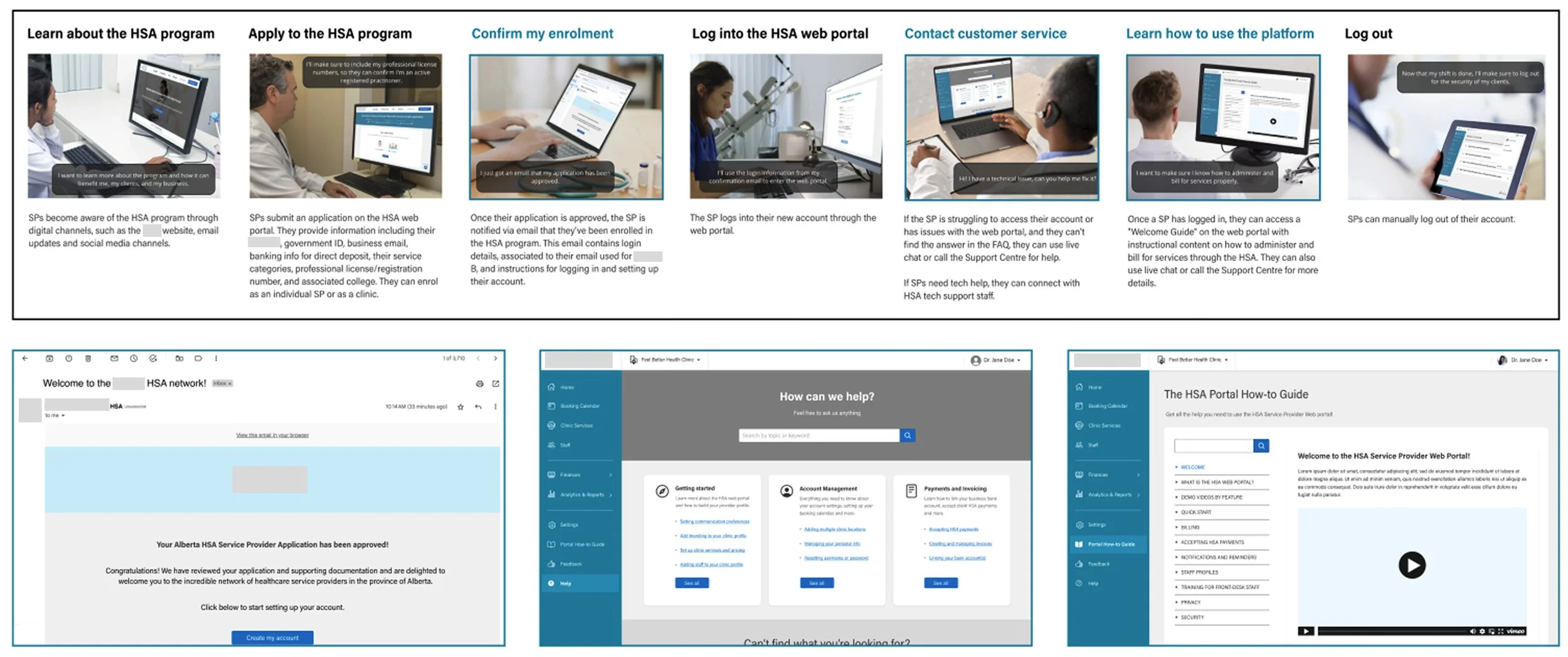
Stage 1: Learn About the HSA and Enrol
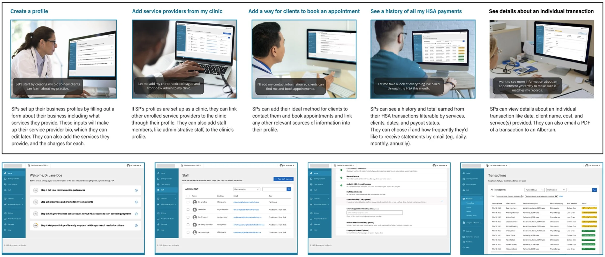
Stage 2 and 3: Set Up Account Details and View Transactions
Stage 4: Process Payments

03. Feedback
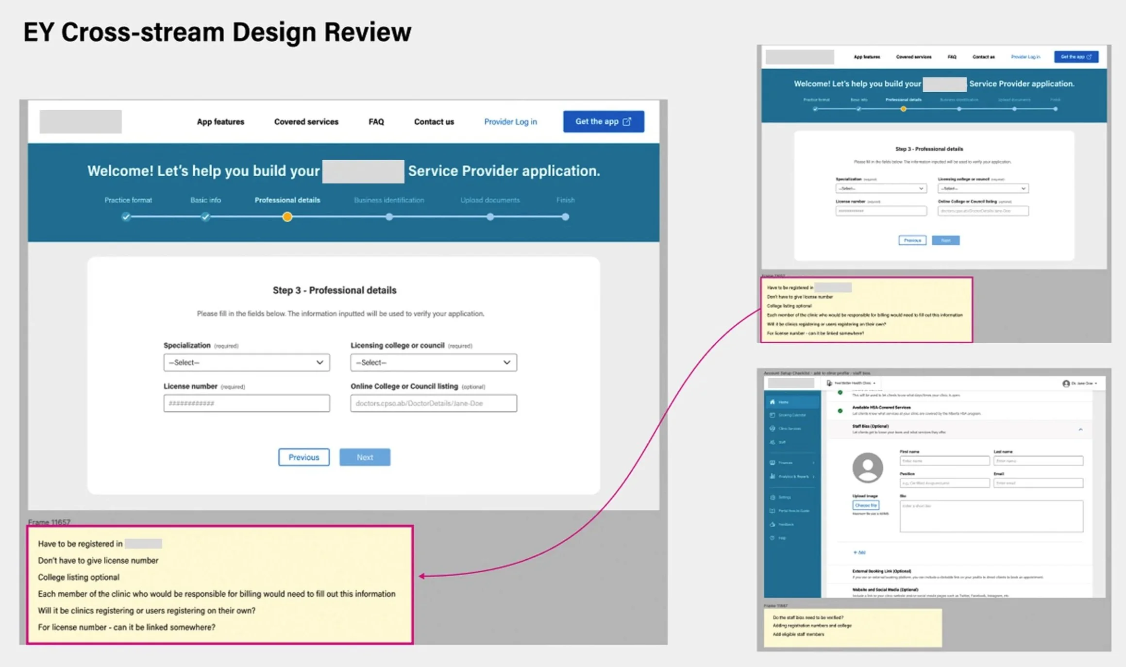
I facilitated and participated in multiple cross-stream Figma design reviews with policy, technology, and operational stakeholders. These sessions ensured that designs were aligned with program rules, technical constraints, and service delivery realities.
My role included:
Walking stakeholders through workflows and edge cases
Capturing structured feedback directly in Figma
Identifying conflicting requirements across streams
Proposing UX alternatives when constraints emerged
Iterating designs to maintain usability while meeting compliance needs
These reviews reduced downstream implementation risk and strengthened cross-team alignment.
Leading cross-stream design reviews in Figma
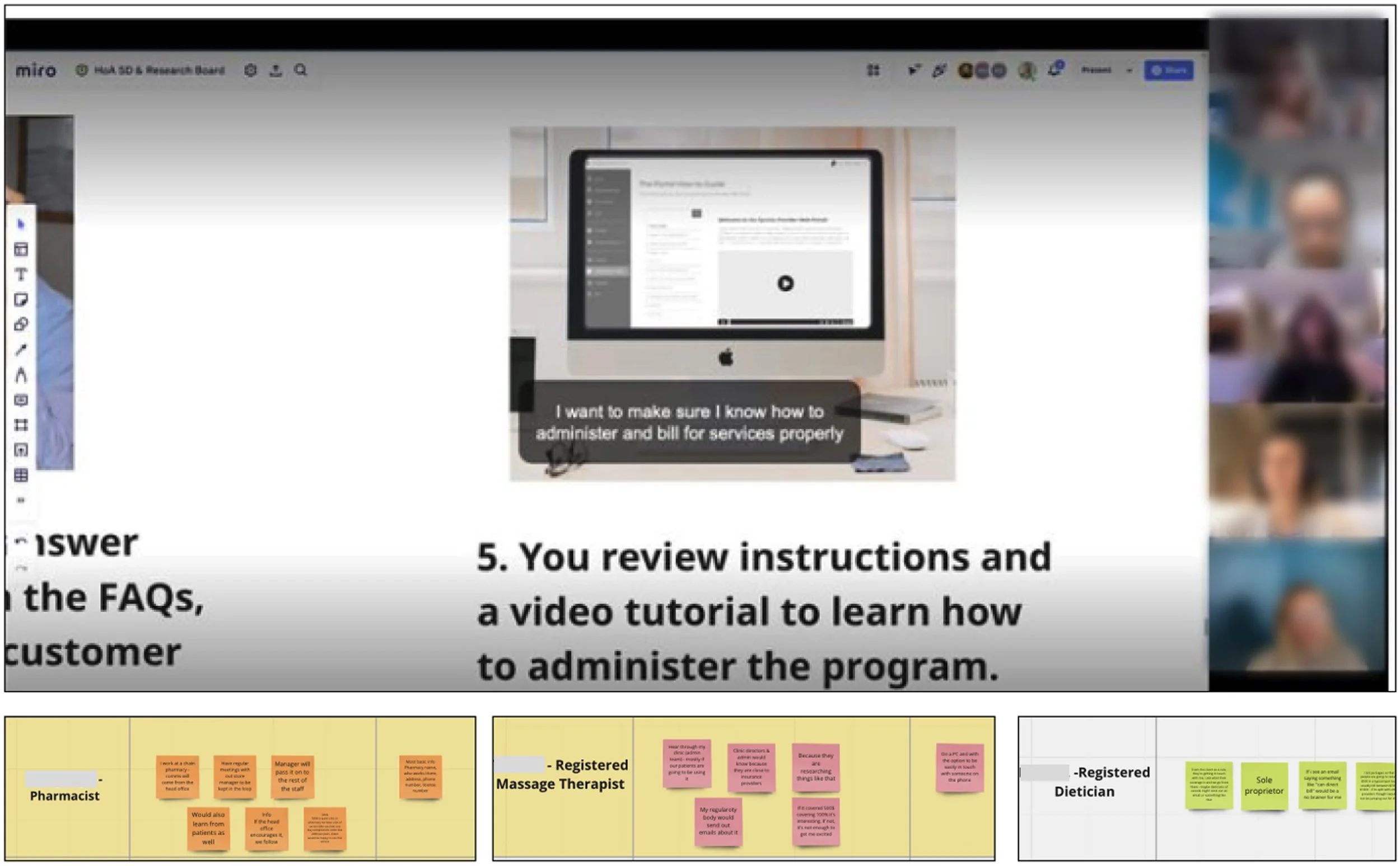
I supported and contributed to co-design sessions with service providers using Figma mockups and Miro boards to gather external feedback. These sessions tested whether the proposed workflows matched real provider expectations, needs, and operational realities.
My contributions included:
Presenting workflows and task flows to providers
Capturing feedback and pain points in real time
Probing for usability risks and misunderstandings
Translating provider feedback into actionable design changes
Prioritizing revisions based on impact and feasibility
This helped ground the portal design in real provider needs rather than internal assumptions.
Co-designing with service providers
04. Synthesis
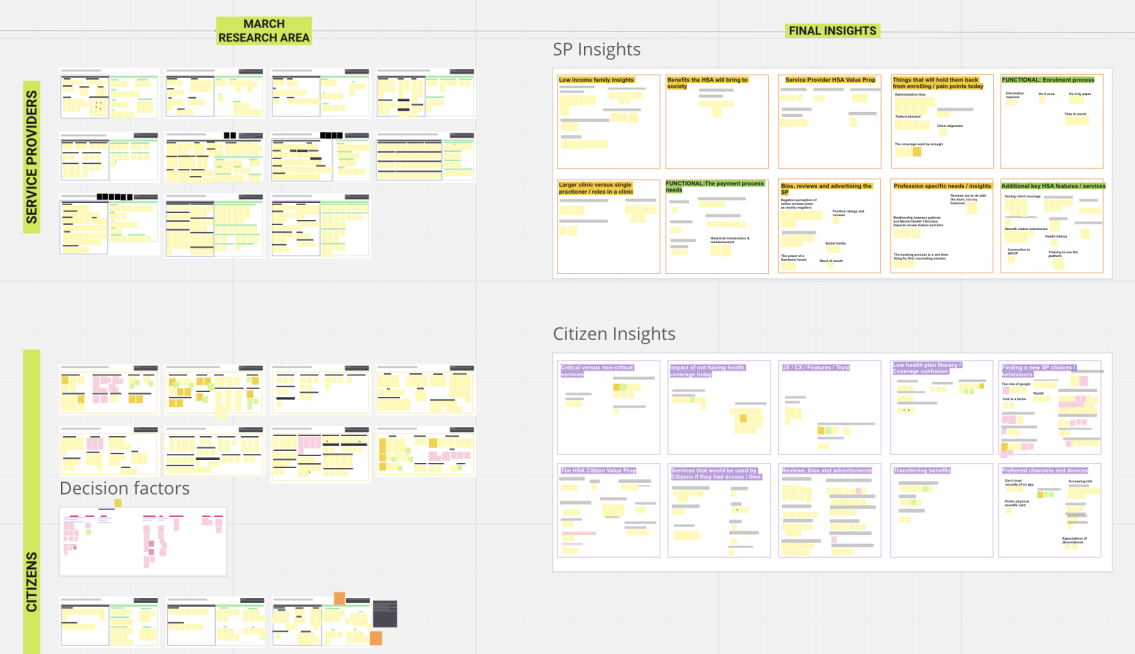
Following internal and external feedback sessions, I helped synthesize insights into actionable UX changes. Using Miro, we clustered findings into themes and mapped them back to specific journey stages and interface components.
I focused on:
Connecting feedback patterns to specific workflow breakdowns
Identifying high-impact UX risks
Translating insight themes into concrete design revisions
Ensuring synthesis outputs directly informed next design iterations
This kept iteration cycles focused and evidence-based rather than opinion-driven.
Synthesizing research into design direction
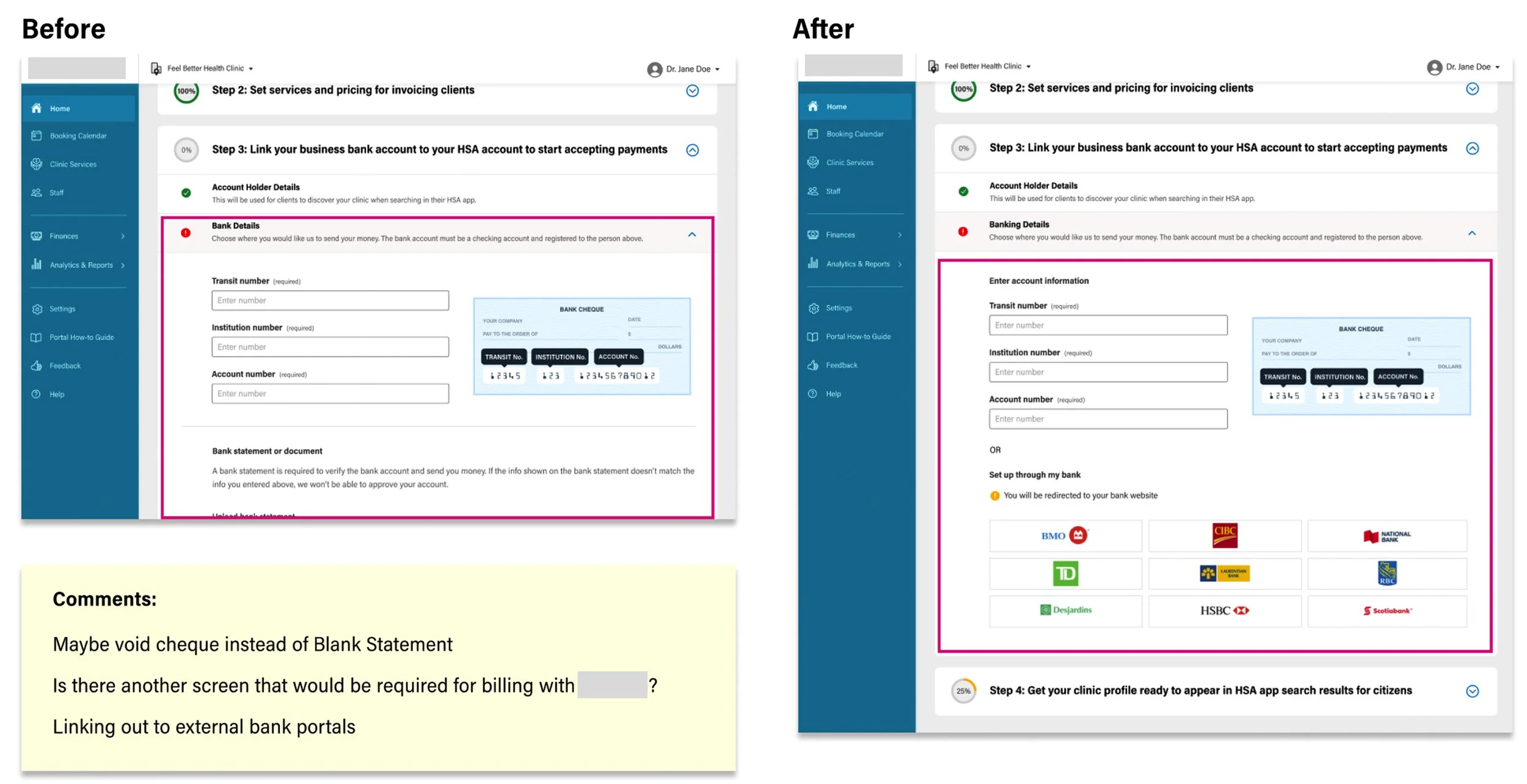
05. Iteration
Iterating designs based on validated insights
Based on research and review feedback, I iterated several critical workflows to reduce friction and error risk. One key improvement involved redesigning the provider bank account connection flow to support external account linking instead of manual entry.
I:
Identified the usability and error risks in the original approach
Proposed a simplified connection model
Redesigned the flow and interface patterns
Validated the revision with stakeholders
Updated related screens for consistency
These iterations improved task clarity, reduced provider burden, and increased confidence in successful completion.
06. Integrate
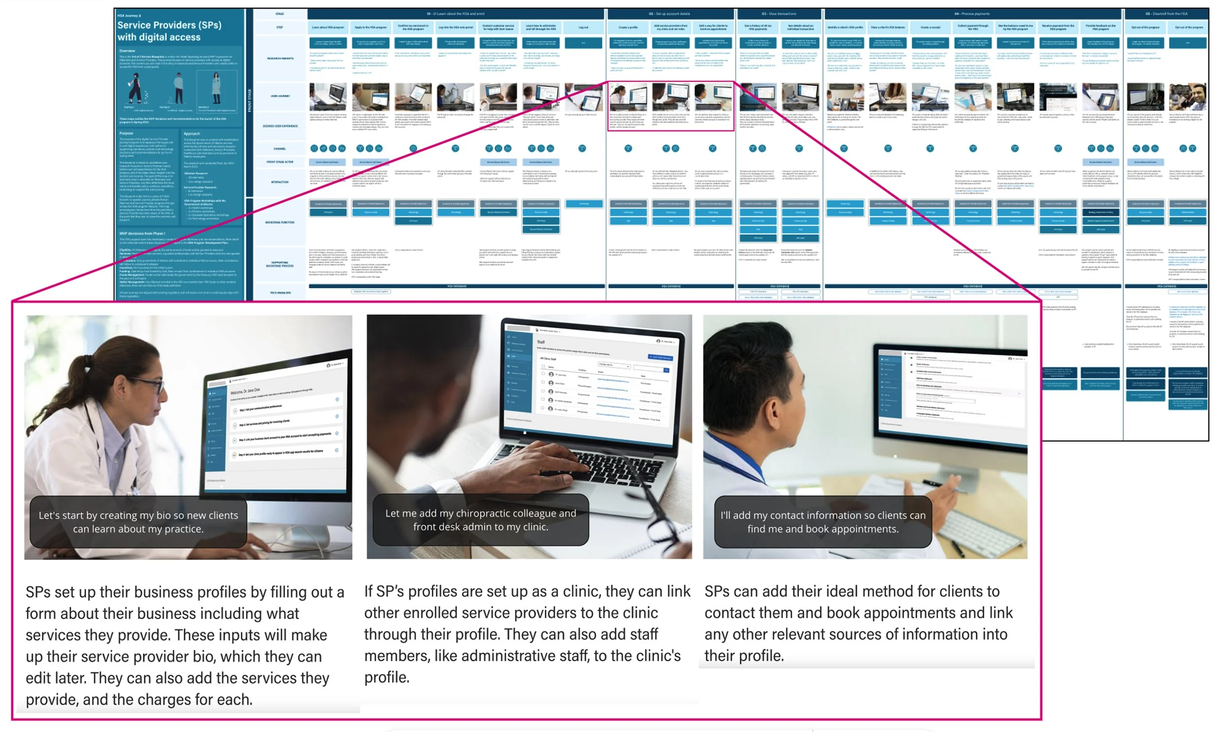
After multiple design and feedback iterations, I worked with the service design team to integrate the finalized provider portal mockups into the end-to-end service blueprint. This step ensured the front-stage digital experience aligned with backstage processes, policy requirements, and operational workflows.
My role in this phase focused on translating detailed interface designs into blueprint-ready journey steps by:
Mapping key screens and task flows to corresponding service blueprint stages
Validating that each UI step was supported by operational and policy processes
Identifying gaps between front-stage user actions and backstage system dependencies
Refining flow definitions to maintain consistency between UX artifacts and service models
Supporting cross-stream alignment between UX, service design, technology, and delivery teams
By connecting the high-fidelity portal designs back to the service blueprint, I helped ensure the digital experience was not only usable, but structurally aligned with how the program would operate in practice. This reduced ambiguity for downstream teams and strengthened implementation readiness.
Integrating UX designs into the service blueprint
Outcome and My Personal Reflection
This project resulted in a fully developed, research-grounded service and UX design foundation for a province-wide healthcare spending account program. Through journey-mapping, co-design, prototyping, and iterative validation, we translated complex policy and operational requirements into a clear, end-to-end provider experience and an implementation-ready portal design.I’m proud of the role I played in shaping the provider workflows and interface patterns, and in helping align user needs with policy and delivery realities. Even with a discovery and design execution scope, the work created tangible direction for future build teams and reduced ambiguity across stakeholders.It was a meaningful experience in designing for real public-sector impact - and reinforced my commitment to human-centred, system-aware product design.